We recently attended Slack frontiers in SF, where we were absolutely blown away by the new Block Kit elements, introduced by the Slack platform team. We especially enjoyed the workshop called ‘Building user-centric app experiences with Block Kit’.
Actually, it was more of a live coding session (show me the code!!) where Sarah, Mark and Katie walked us through redesigning an app that used older elements to the one that utilizes the newest UI elements in the block kit, to offer a much neater and more usable experience to users.

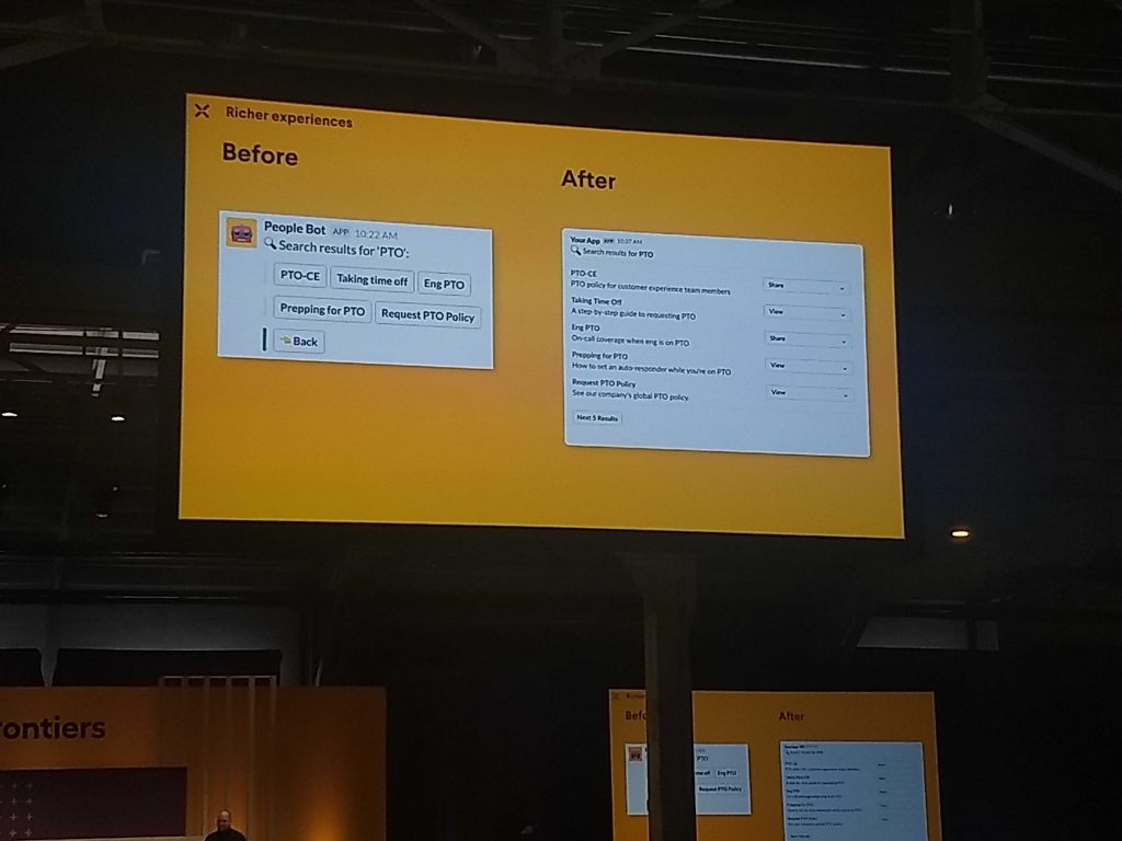
Sorry for the poor photo. I was right at the back during this workshop.
What you see in the photo, above was the final before-after comparison and clearly, the After part looks a lot more readable and usable.
Taking a cue from this, we have redesigned our ‘help’ message as well. Our users would know that ‘help’ is the go-to command to learn more about using AttendanceBot and having a much clearer, more usable response to it, will go a long way in making AttendanceBot more user-friendly.
We’ve put our before and after screenshots below for reference below. Do let us know what you think of it.
Here’s what it looked like before.

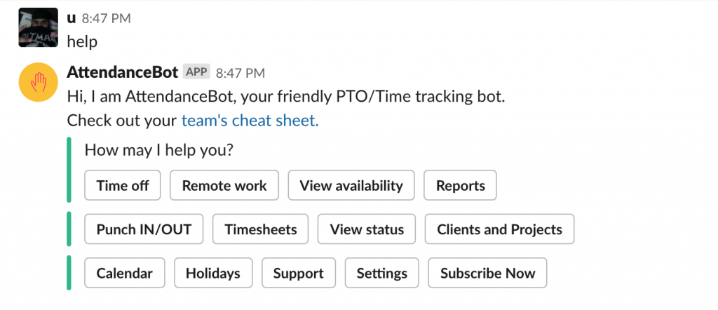
Before
And here’s what it looks like now.

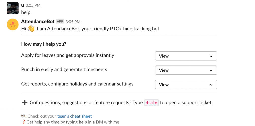
After